Branding & Catalog Production
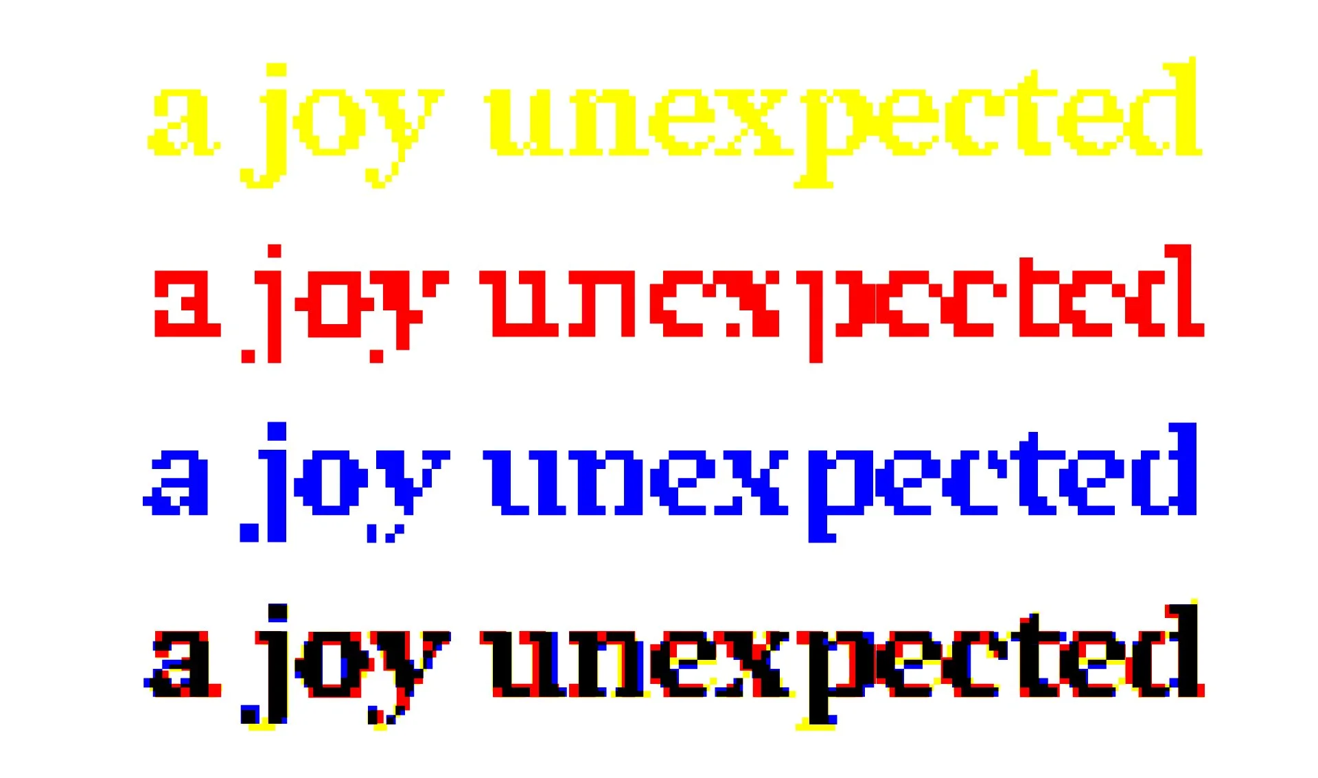
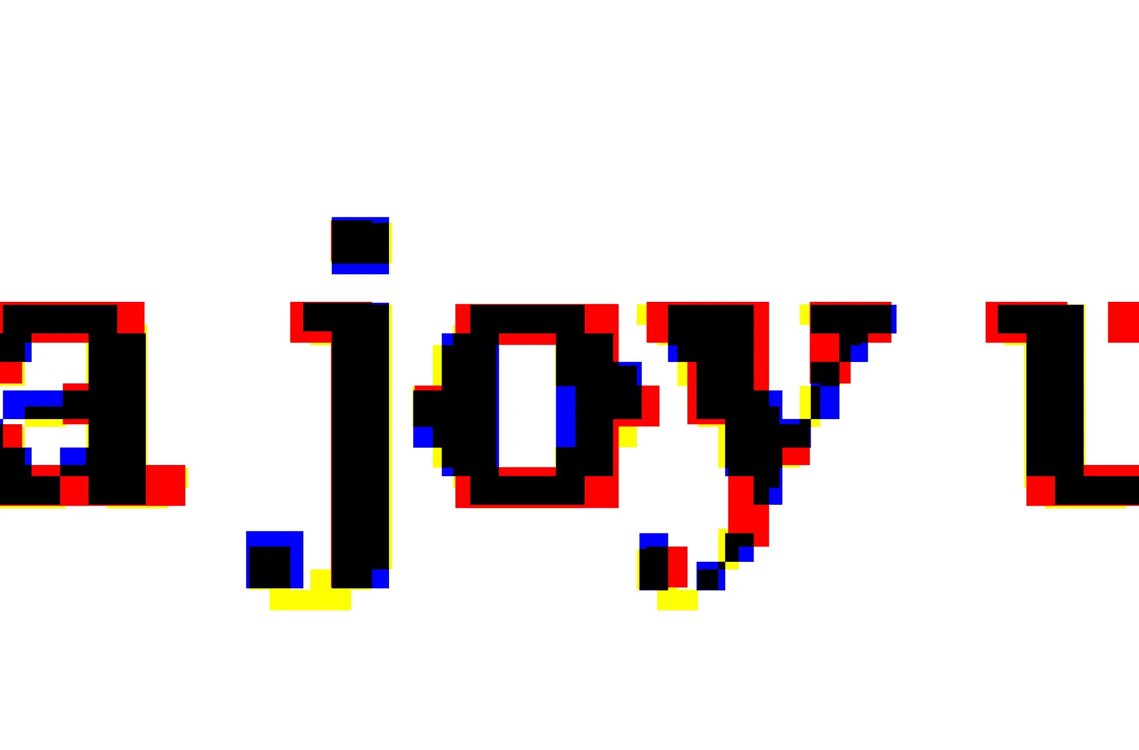
How can joy be achieved when the future and present are beset with racism, intolerance, and violence? A Joy Unexpected reveals what is difficult to see within us during times of comfort. This branding visualization uses various weights/styles of Redaction, a bespoke typeface commissioned by Titus Kaphar and Reginald Dwayne Betts’ The Redaction exhibition at MoMA PS1:
The Redaction project seeks to highlight the abuses in the criminal justice system, in particular the way poor and marginalized people are imprisoned for failure to pay court fines and fees. When Titus Kaphar and Reginald Dwayne Betts began their collaboration on The Redaction, they identified that typography should be an important extension of the work. Using legal documents from claims filed by the Civil Rights Corps as source material, Betts crafted new poems by redacting out superfluous information – text that is juxtaposed with Kaphar’s portraits of the individuals represented in the claims… As contemporary design moves through a zeitgeist of pixelation, with many incredible examples online, the team recalled the landmark designs by Susan Kare for the original Apple Operating System and many of Zuzana Licko’s early digital fonts for Emigre. The team maintained a conceptual framework for the degraded versions; it’s decidedly not merely an aesthetic. By providing a range of grades from subtly analog to nearly illegible, the typeface nods to the transformation and marginalization that many people face in the criminal justice system today, and specifically, the role and responsibility of the author of text to be conscious of legibility as a signature of power.” –redaction.us